Minnesotans need accurate data. Data on COVID-19 infections and deaths—and the modeling of that data—is key to decision-making during this public health emergency. If this data is poorly presented, it creates a false narrative about the facts on the ground, contributing to incorrect perceptions of danger, overly burdensome executive orders, and a longer-than-necessary economic shutdown.
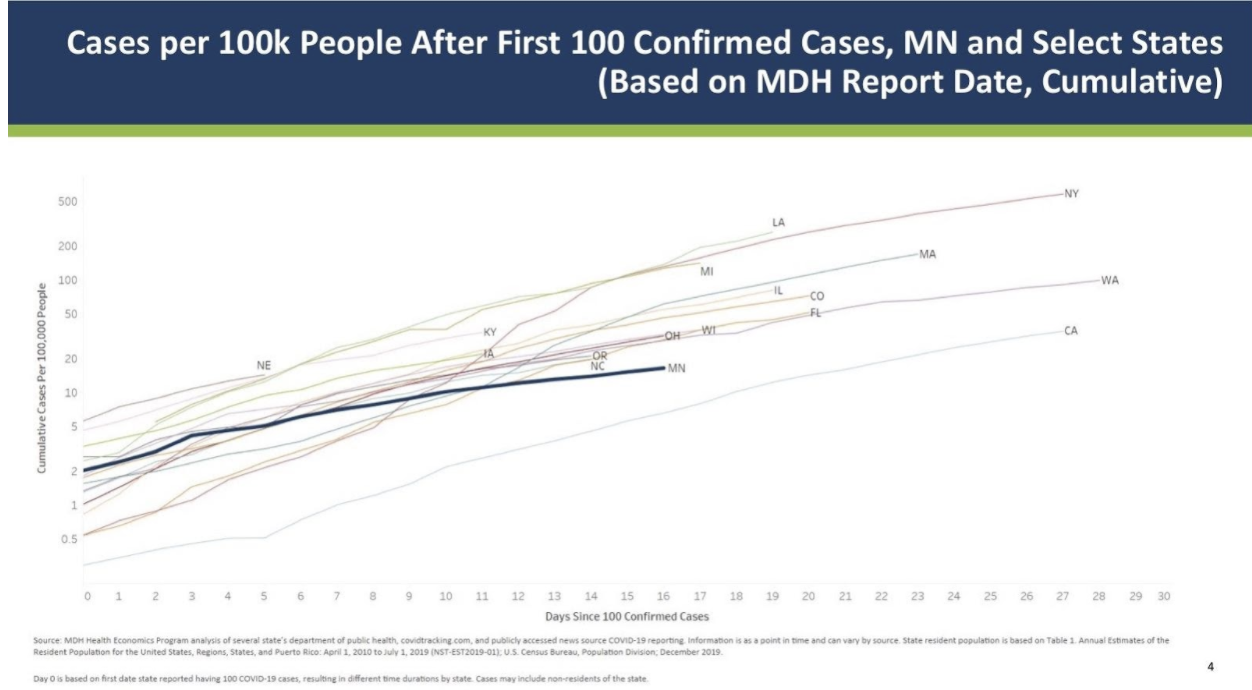
On April 8, roughly eleven minutes into a video press conference, Minnesota Governor Tim Walz displayed a line graph created by the Minnesota Department of Health (MDH).
This graph compared confirmed COVID-19 cases in Minnesota to confirmed cases in 16 other states. By the looks of it, these states are all on the same trajectory. In short, it appears it’s just a matter of time before each state is facing New York-levels of COVID-19 cases, but there’s a slight problem with the line graph.

Look closely at the X- and Y-axes. The X-axis (horizontal) displays the number of days since a state counted at least 100 COVID-19 positive cases. No problem here.
However, the Y-axis (vertical) employs an irregular, but exponentially increasing, number to describe the amount of COVID-19 positive cases per 100,000 individuals in each state.
Do you see the problem?
The Y-axis starts out small, with just 0.5 cases per 100,000 residents. It then increases to 1, 2, 5, 10, 20, 50, 100, 200, and 500. Visually, the spacing between 0.5 and 10 is almost the same as the spacing between 20 and 500. Because the Y-axis numbers do not increase proportionally, the shape of every line is distorted, making it seem as though every state is on a similar path for COVID-19 cases. Just look at Minnesota: our state’s confirmed infection rates look to be about half as bad as New York when it actually has about 1/30th of the reported COVID-19 cases.
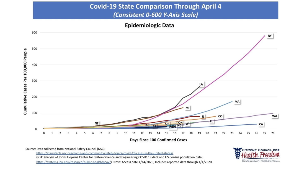
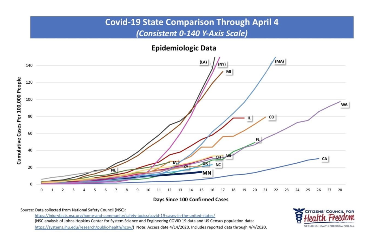
This is why Citizens’ Council for Health Freedom (CCHF) created new graphs with a consistent Y-axis scale. Using publicly available information on COVID-19 cases in each of the same states as the misleading MDH graph, our graph shows a very different picture of the current status of COVID-19 cases.
Cases in Minnesota (shown below with a thick navy blue line) are nowhere close to the number of cases in New York per 100,000 people.

To make it easier to understand, and because the differences between the states are so great, we created two graphs: one that goes from zero to 600 cumulative cases (0-600 Y-Axis – see above) and one with up to 140 cumulative cases for every 100,000 people (0-140 Y-Axis – see below). Unlike the graph from the Minnesota Department of Health, we kept the Y-axis consistent in both.

Compare the MDH graph to the CCHF graphs. The differences between the two are pronounced, even though they contain the same data-points.
If the oft-stated goal is to “flatten the curve,” why are Minnesota officials employing graphs that create misleading curves? Is this an unintentional oversight or a deliberate misrepresentation? Watching the number of executive orders and expanding government powers, it appears that this distorted graph is being used to justify far-reaching, economically-consequential public policy decisions, such as extended stay-at-home orders.
CCHF’s recommendations during a declared emergency have never wavered. Government officials have a responsibility to provide accurate and persuasive information to educate the public. They must avoid using coercive tactics or misleading information. When properly informed, the American public can be trusted to make the right decisions for themselves, their families, and the country.
Now more than ever, as individuals have been ordered to stay home, businesses have been shuttered, employees have lost jobs, and retirees have lost nest eggs, Minnesotans deserve accurate and transparent information – not distorted diagrams that mislead and harm the public’s trust.


